Navigation Menus
Navigation menus form the spine of any web site, fortunately the software allows you to easily customize your navigation to fit any design layout. Navigation can be found underneath Site Manager in the My Apps Menu.
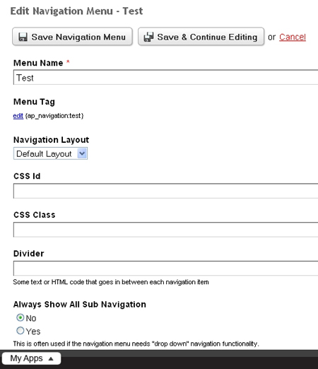
Upon selecting Add a New Navigation Menu from the top right, you will first enter a Menu Name, which will automatically create a Menu Tag. This tag is what you will enter into the template or content block in order to utilize the given menu. Below this, you can assign a CSS Id or Class. Please note: the Id and/or Class are applied to the <ul> in your structure.
The last field of interest is the Divider field, where you can further customize the appearance of your menu by placing an image or character in between each list item. To display an image enter in the HTML tag within the field, similar to: <img src="/images/documentation/dividerIcon" />.
Adding List Items:
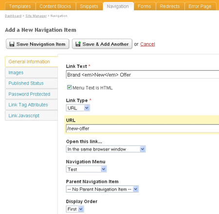
Once a menu has been created, you can edit any list items on the Navigation Menu Details page. To start populating the menu with links, click the Add a New Navigation Item in the top right. You will see that there are a number of tabs on the left-hand side for different properties of your navigation menu item, upon opening the page, the General Information tab is already open. Here you enter the the most basic information about the current navigation menu item such as:
General Information Tab:
Adding a HTML or Anchor Link:
Link Text:
This is the text that will actually appear hyperlinked. In the example to the right, the link would be displayed how it is entered verbatim. However, since the Menu Text is HTML box is checked, the software will recognize that the <em> tag is not part of the link text, but rather is adding emphasis to the word "New".
Link Type:
Select URL (default), a page anchor, or an email link (discussed shortly).
URL:
This is the destination. If Anchor is selected for the Link Type then the URL should include the anchor tag name.
Open this link...:
How the link will open (same window, new, etc.)
Navigation Template:
Which Navigation Template you wish to use, from a list of those created.
Parent Link:
If you wish to have the link a sub-page of one already created, select the page which the new one will go under.
Display Order:
Allows you to specify in which order the link will appear. Select from First, Last, Before, and After.
Note that if First or Last are selected, subsequent First and Last selections will override previous. That is, if you were to select Last for every item, the order is last relative to when you enter. If the next item is designated Last, it will be after the previous entry of Last. When selecting Before and After, you will then be asked to specify which page you are calling into reference.
Adding an Email Link:
The email link option contains many of the same fields as a standard URL link does, in addition to a few email specific ones: Email Address, Email Subject, and Email Message. The Subject and Message entered here will be pre-filled into the corresponding fields when the users email client is loaded (such as Microsoft Outlook, etc.).
Images Tab:
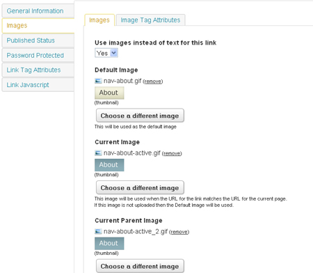
From the select bar, choose if you wish to use an image instead of text, and click the Choose an Image button that is produced. Next, Browse your hard drive for the desired image, and click the Upload button to view a small preview of the selected image. Once you have confirmed the image from the provided thumbnail, choose to Use This Uploaded Image.
Note: If only the first image upload field is completed, then this image will be the only one used for that navigation item. If you wish to use an image for the Active, Active Parent, or Hover state, you would follow the exact same procedure for the appropriate field. In the example to the right, the default image will be a yellow tile for the "About" page, and all other states will use a different image.
Published Status Tab:
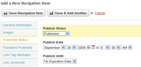
The Published Status tab gives you control over when the page can be viewed. The default is Published, that is, viewable by the public immediately. You can also choose to have the page set to Publish Later and define the date and time that the page will be published. The last publishing option is to have the page Not Published. The second select bar, the Publish Until dictates how long the page is viewable, set down to the day and time. After this time, the page will automatically be set to Not Published.
Password Protected Tab:
The Password Protect page give the option to have privileged areas of a website for member, employees, etc. Display This link: Always is the default, however you can also choose to hide it so that non-members can't even see the link. Below, you can set the User Groups which can access the restricted area of your site.
Link Tag Attributes Tab:
The Link Tag Attributes tab permits you to style the link tag itself by declaring the appropriate Class or Id. To illustrate, refer to the sample code:
<div id="main-nav">
<ul class="products">
<li class="in-stock"><a href="#">item one</a>
<ul>
<li class="in-stock"><a href="#" class="local">one-a</a></li>
<li><a href="#" class="remote">one-b</a></li>
</ul>
</li>
<li class="in-stock"><a href="#" class="local">item two</a></li>
<li class="in-stock"><a href="#" class="local">item three</a></li>
</ul>
</div>
If we had a declaration in our stylesheet to target only those products that were "local", we would add "local" to the CSS Class to apply the appropriate styling to these <a> tags, and not to the others with a different, or no class at all.
Other Link Attributes:
Under this tab you refine the functionality of the links; the Link Tag CSS described above deals more with the presentational aspect of the links. You can assign:
- Title: Which gives the link a unique title
- Rel: This states the "relationship" between the referencing document, and the one being referenced.
- Tab Index: Determines the order in which the link will be selected when pressing the Tab key (e.g. a value of "4" would mean the link is the 4th in the Tab Index sequence).
- Access Key: This is a shortcut to quick select the link:
- In Internet Explorer/Windows press Alt + accesskey
- In Firefox/Windows press Alt + Shift + accesskey
- Most Mac users can press Ctrl + accesskey
Link Javascript Tab:
Here you can assign Javascript functions to the link itself, a list of supported functions are listed with corresponding text-fields for you to easily enter the desired commands.