General InformationCategoriesTagsPublished StatusHeader/FooterDesign/SEOURL Key |
Page TitleDescription/KeywordsLayoutCSSJavascriptHead Content |
Adding Items
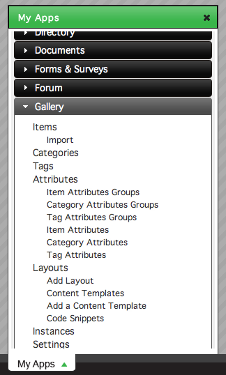
To add an item to the gallery, click Items under the Gallery section in the My Apps menu.
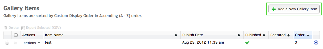
In the Gallery Items window, click the Add a New Gallery Item in the top right corner.
This will take you to the Add a New Gallery Item window.
General Information
At this window, you have four fields for your gallery item: the Item Name, the Primary Images, the Featured setting, and the Description.
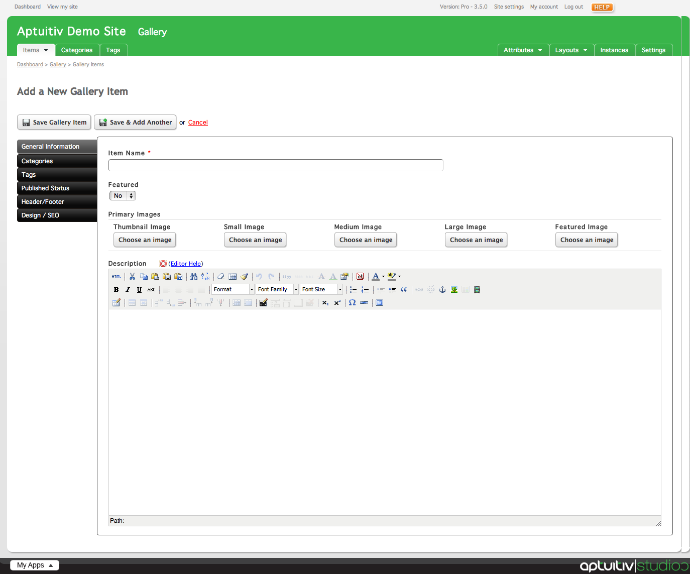
Give your item a name by inserting a value into the Item Name field. Note: this field is required.

The Featured setting controls whether your item should be featured, or more important, over other items in your gallery. Setting items to Featured allows you to more easily style them separately from normal gallery items.
Set whether you want your item to be featured by choosing a value from the select menu. By default, the item is set to not be featured.

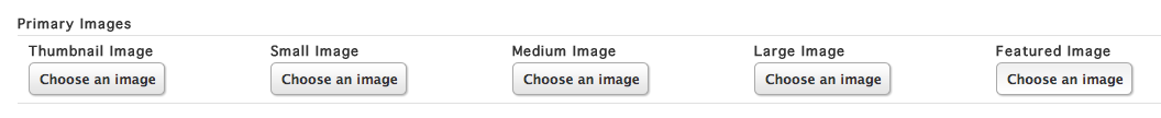
The Primary Images set allows you to pick multiple versions of your image for each image size that can be used in your gallery templates. There are two methods for Primary Images set: upload each image individually, or upload one image and have it resized for other versions. By default, Branch creates five image upload fields for you to choose images for.
Choose an image to upload by clicking Choose an Image for the corresponding image size. For more information on uploading images, visit the Uploading Images documentation.
Give your item a description using the Rich Text Editor below the Primary Images set.
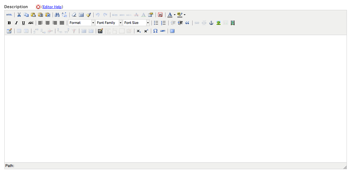
For more information about the Rich Text Editor, view the Rich Text Editor documentation.
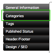
Categories
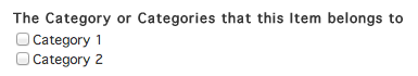
If your gallery has categories set up, you can assign items to categories by clicking the Categories tab on the left of the Add a New Gallery Item window.
Items can be assigned to multiple categories. To assign your item to a category, click the checkbox to the left of the category.
Tags
Tags can be assigned to your category by clicking the Tags tab on the left side of the Add a New Gallery Item window.
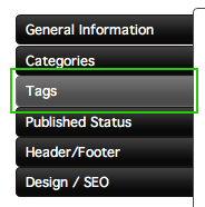
Tags are used to make content easily sortable by attaching keywords to them. Tags are not exclusive to the gallery, meaning they can also be assigned to other content on your site, like blog posts.
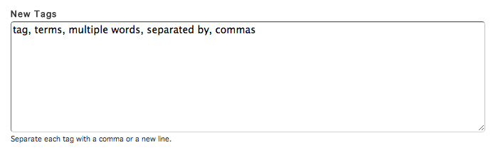
To add tags to your gallery item, enter in values into the text area in the Tags window. If you're adding multiple tags to your item, separate them with a comma or by putting each term on a new line.
Published Status
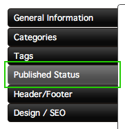
To set the published status of your item, click on the Published Status tab on the left side of the Add a New Gallery Item window.
There are three different publishing options. You can choose one from the Publish Status select menu.
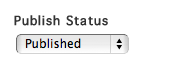
Published means that the item is updated and published as soon as you save it.
Publish Later allows you to set a future date when the item will be automatically published.
Not Published makes the item unpublished and not viewable on your site.
The Publish Date controls when the post is published. You can choose a date and time by choosing values from the select menus.
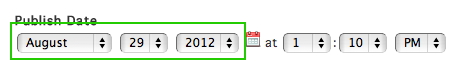
Alternatively, you can select a date by clicking the Calendar icon to bring up the date picker.
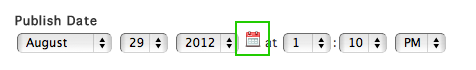
Pick a click on a date in the date picker to choose the date.
Setting the Publish Date to a future date will only affect items that are set to Publish Later.
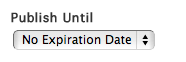
By default, published items will stay that way until they are manually unpublished. However, items can be automatically unpublished after a specific date. To do this, choose A Specific Date under the Publish Until select menu.
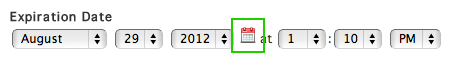
Set the expiration date by choosing values from the Expiration Date select menus.
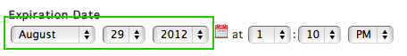
Similar to choosing a publish date, you can click the small calendar icon to select a date using the date picker instead of the select menu.
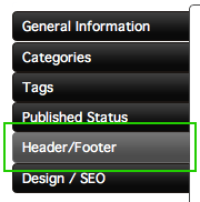
Header/Footer
Item headers and footers can be included in layouts, and can contain anything that you can create in a rich text editor. To change the header and footer settings, click the Header/Footer tab on the left side of the Add a New Gallery Item window.
In the Header/Footer window, there are two separate tabs for the Header and Footer settings for the item. The process for changing the settings is the same for both.
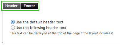
The Header and Footer are automatically set to use the default text. To use your own custom content, select the use the following header/footer text option. Clicking this option will bring up a rich text editor.
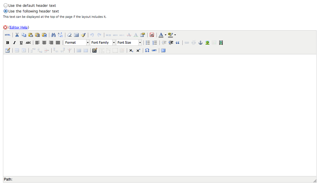
Insert your content into the rich text editor.
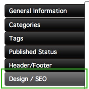
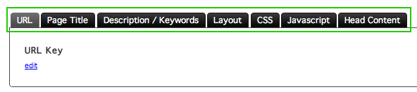
Design/SEO
Certain design and SEO aspects for the item that you're creating can be changed by clicking the Design/SEO tab in the Item window.
The Design/SEO window contains tabs for different settings for your item.
URL Key
To change the URL Key settings, click the URL tab in the Design/SEO window.
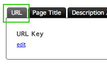
The URL key is automatically generated based on the name you give to your item. If you want to change the URL key to a custom value, click the edit link in the URL window.
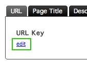
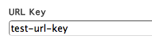
Clicking the edit link will bring up a text field. Insert the value you'd like for the URL key in the field.
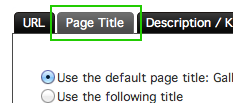
Page Title
The page title is used when viewing the item page on the site, and can be changed by clicking the Page Title tab in the Design/SEO window.
The page title is automatically set to be "Gallery Category - Item Name", where item name is the name that you've given your item. The title can be changed by selecting the Use the following title option.
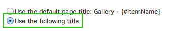
Selecting this option will bring up a text field that will allow you to change the page title seen when a user is viewing your item.
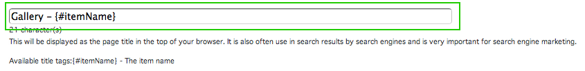
The variable {#itemName} can be used to pull in the name of your category into the page title instead of manually typing the category name into the text field.
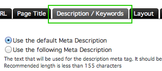
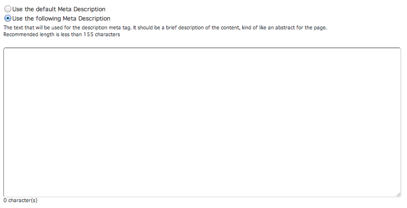
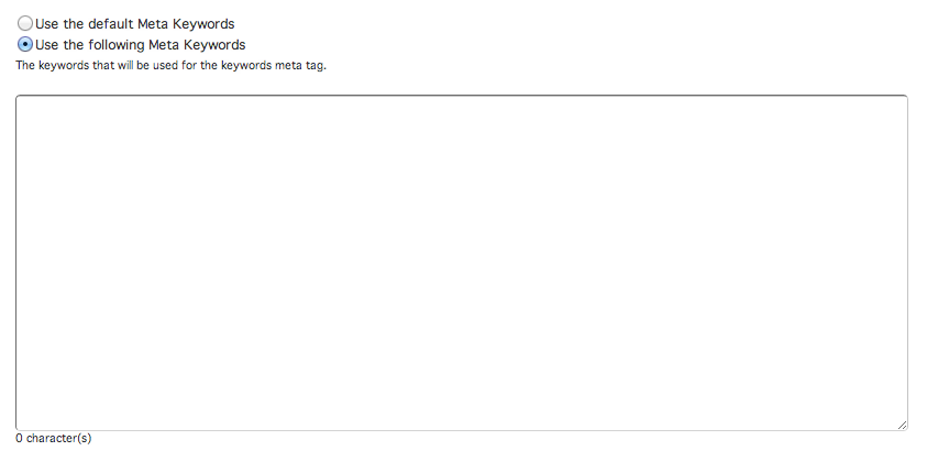
Description/Keywords
The Meta Description and Keywords can be changed by clicking the Description/Keywords tab in the Design/SEO window.
The site automatically uses the default Meta Description and Keywords for your item. To use your own description, click the option Use the following Meta Description. This will bring up a text field where you can insert your own description for the item.
To use your own Meta Keywords, click the Use the following Meta Keywords option to bring up a text field. Here, you can insert your own keywords for the item.
Please note that while the description is useful as a short description of your page in a search engine listing, meta keywords are not taken into account by most major search engines.
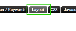
Layout
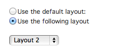
Items, by default, use the layout assigned to them in the Gallery settings. If desired, however, individual items can be set to use a different layout from the one set in the Gallery settings by clicking the Layout tab in the Design/SEO window.
To change the layout the item uses, click the Use the following layout option. Clicking this will bring up a menu that you can select a different layout from.
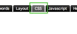
CSS
CSS settings and body tag attributes can be set for individual pages by clicking the CSS tab in the Design/SEO window.
The CSS and body tag settings use the default ones defined by the content templates and template.
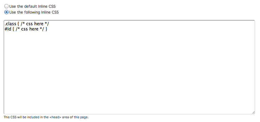
To use custom inline CSS for the item, click the Use the following Inline CSS option. This will bring up a text field that you can insert CSS into. This will override the inline CSS in the content template that is used in your site layout and the site settings for the Item Page.
To link different CSS files instead of the default CSS files linked in the content template being used by the layout, click the Use the following CSS Files option. This will bring up a text field that you can use to add the file path(s) to the CSS file(s) on your server. If multiple files are being added, put each file path on its own line.
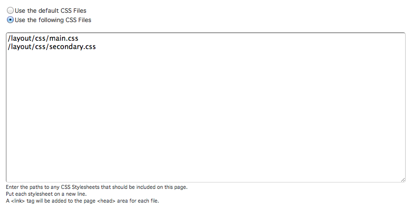
Including these files here will override the files included in the content template for the category and the files included in the Item Page settings.
The ID given to the body tag for the item that you're editing can be changed by clicking the Use the following body tag id option. Clicking this will bring up a text field, where you can insert a value.
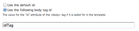
Since HTML tags can only have one ID assigned to them at a time, insert only one value into the text field.
To give the body tag custom classes instead of the default classes assigned to it in the Item Page settings, click the Use the following body tag class option. This will bring up a text field where you can insert values to be assigned to the body tag.
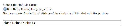
Unlike IDs, HTML elements can have multiple classes assigned to it. If you want to assign multiple classes to the body tag, add a space in between each class you insert into the field.
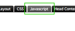
Javascript
Similar to CSS, inline Javascript and Javascript file settings can be changed from the default ones used in the content template and the Item Page settings. To access these settings, click the Javascript tab in the Design/SEO window.
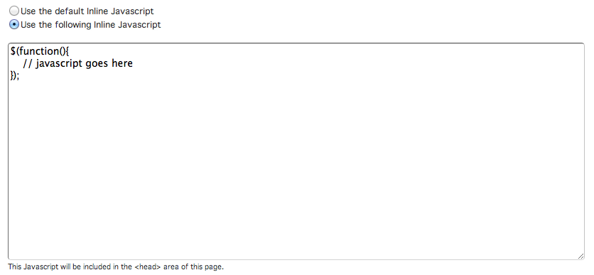
To change the inline Javascript, click the Use the following inline Javascript option. This will bring up a text field where you can insert Javascript.
[image of option selected with field, and javascript inserted]
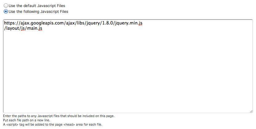
To link different Javascript files instead of the default Javascript files linked in the content template being used by the layout, click the Use the following Javascript Files option. This will bring up a text field that you can use to add the file path(s) to the Javascript file(s) on your server. If multiple files are being added, put each file path on its own line.
Head Content
To change the Head Content settings for the item, click the Head Content tab in the Design/SEO window.
To use your own Head Content, click the Use the following Head Content option. This will bring up a text field. Enter in the content you want to use for the Head Content.
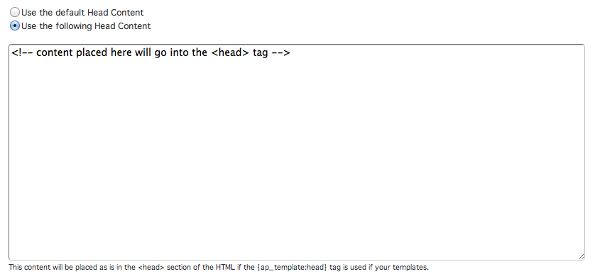
The content inserted into this field will be put into thesection of your site if your template uses the {ap_template:head} tag.