Adding a New Navigation Item
General InformationLink TextMenu Text is HTMLLink TypeNavigation MenuParent Navigation Item |
ImagesImage Tag AttributesPublished StatusPassword ProtectedLink Tag AttributesLink Javascript |
To add an item to a navigation menu, click Add a New Navigation Item on the top right of the Navigation Menu Details window.
This will take you to the Add a New Navigation Item window.
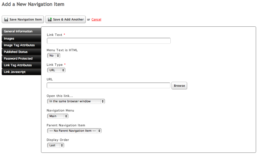
General Information
The General Information tab controls the link text, type, and menu settings.
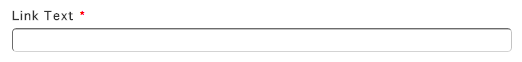
Link Text
Give your navigation item a name by inserting a value into the Link Text field.
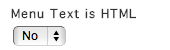
Menu Text is HTML
The Menu Text is HTML select menu controls whether the string inserted into the Link Text field should be rendered as HTML or not.
You can change this setting by selecting a value from the Menu Text is HTML select menu.
For example, if a link contains an ampersand (&) and is not interpreted as HTML, the software will convert the & to & so it is properly understood by the browser as an HTML entity. If the link text is interpreted as HTML, then using an ampersand in the link text field can cause an error in the browser, because & is the start to a lot of HTML entities.
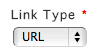
Link Type
The Link Type menu controls what type of link the navigation item will be. By default, the Link Type is a URL. You can change this by choosing a value from the Link Type select menu.
URL
The URL option shows the URL field, allowing you to link to a page on your site. You can either enter the URL into the URL field or click Browse to the right of the field to bring up the page browser.
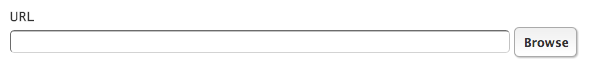
For more information on the Page Browser, view the documentation.
The Email option creates a link that allows the end-user to send an email to a specified email address.
Choosing Email will show the Email Address, Email Subject, and Email Message fields. Inserting values into these fields will alter the way the new email that the end-user is sending will behave.
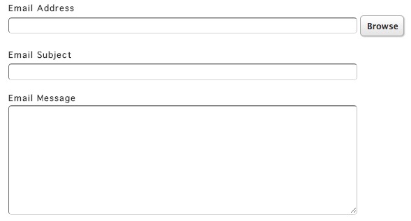
The Email Address field controls who the email will be sent to.
The Email Subject field will set a pre-determined subject line on the email when the end-user clicks on the link.
The Email Message field will insert pre-determined body content into the email body when the end-user clicks on the link.
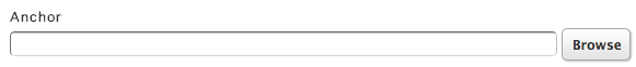
Anchor
An Anchor point can be given to the navigation by choosing Anchor from the Link Type menu.
Anchors are typically used to be able to "jump" to a certain point on a page when a user clicks on a link pointing to the anchor. Inserting a value into the Anchor field will scroll the page to that location.
API
The API option allows you to place content into the link tag from any API tag. For example, you can place the categories of a gallery into the link tag.
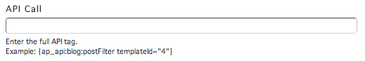
For more information and an example, view the API Navigation Item documentation.
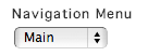
Navigation Menu
You can choose which navigation menu to assign the navigation item to by choosing a value from the Navigation Menu select menu.
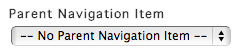
Parent Navigation Item
A navigation item can have a parent navigation and child navigation items. Typically you see this when a site uses a drop down navigation.
To assign a navigation item a parent navigation item, pick an option from the Parent Navigation Item select menu.
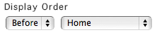
Display Order
You can change the display order of the navigation item in the item's level by picking an option from the Display Order select menu.
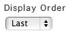
Picking Before or After will allow you to choose another item in the menu to to place the item before or after.
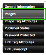
Images
Navigation Item image settings can be accessed by clicking the Images tab on the left side of the window.
Instead of using text for the navigation item, images can be used instead by choosing Yes from the select menu in the Images tab.
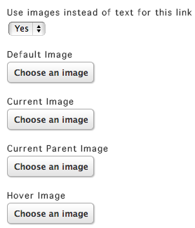
Choosing Yes will allow the upload of four images that correspond to different navigation item states.
The Default Image is the image that is seen normally.
The Current Image is used when the user is at the page on your site that the navigation item points to.
The Current Parent Image is used when the user is at a page on your site that belongs to a child of your navigation item.
The Hover Image is shown when the user hovers over your navigation item.
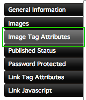
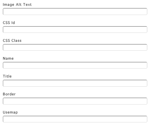
Image Tag Attributes
Image Tag Attributes can be given by clicking the Image Tag Attributes tab on the left side of the window. These settings apply only when there are image being used for the navigation item.
Assign attributes to the image by inserting values into the fields.
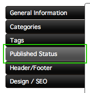
Published Status
To set the published status of your item, click on the Published Status tab on the left side of the Add a New Navigation Item window.
There are three different publishing options. You can choose one from the Publish Status select menu.
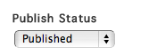
Published means that the item is updated and published as soon as you save it.
Publish Later allows you to set a future date when the item will be automatically published.
Not Published makes the item unpublished and not viewable on your site.
The Publish Date controls when the post is published. You can choose a date and time by choosing values from the select menus.
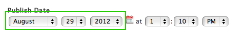
Alternatively, you can select a date by clicking the Calendar icon to bring up the date picker.
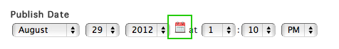
Pick a click on a date in the date picker to choose the date.
Setting the Publish Date to a future date will only affect items that are set to Publish Later.
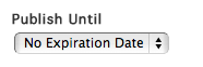
By default, published items will stay that way until they are manually unpublished. However, items can be automatically unpublished after a specific date. To do this, choose A Specific Date under the Publish Until select menu.
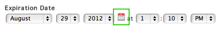
Set the expiration date by choosing values from the Expiration Date select menus.
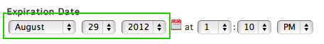
Similar to choosing a publish date, you can click the small calendar icon to select a date using the date picker instead of the select menu.
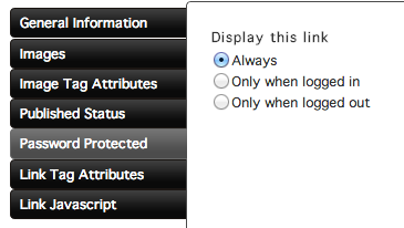
Password Protected
You can change the Password Protected settings by clicking the Password Protected tab on the left side of the window. These settings allow you to choose when to display the navigation item.
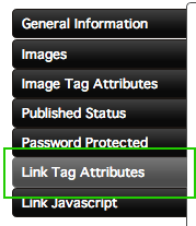
Link Tag Attributes
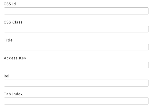
Link Tag Attributes can be edited by clicking the Link Tag Attributes tab on the left side of the window.
These settings apply to the link tag that is wrapped around the text (or image) in your navigation item.
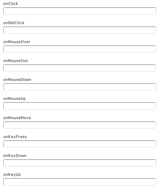
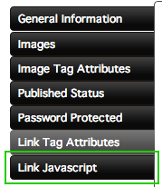
Link Javascript
Link Javascript can be edited by clicking the Link Javascript tab on the left side of the window.
The fields in the Link Javascript tab refer to events that happen when a user hovers over the navigation item, clicks on the item, and more.