We're pleased to announce that the navigation within the new interface for BranchCMS is now responsive and mobile friendly.
While the entire administration isn't fully mobile friendly yet, this is a big step towards that goal.
Click on the menu button in the upper right to reveal the primary navigation.
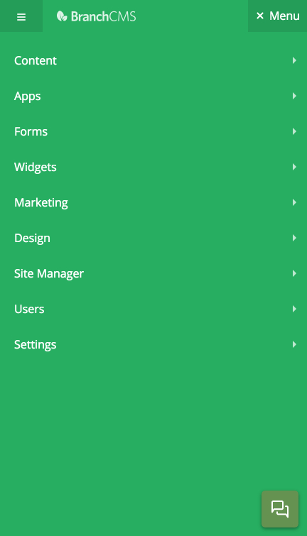
You will notice that on smaller screens the left sidebar is completely hidden when it's collapsed.
Click on the menu button in the upper left to reveal the sidebar navigation.
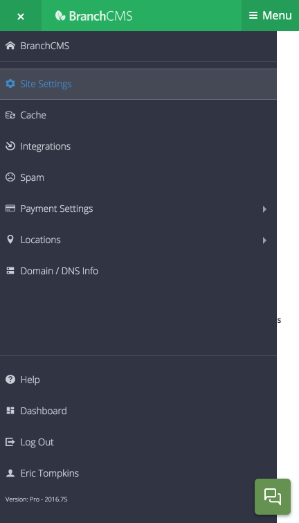
When you are within a section of the administration the sidebar holds the navigation specific to that section. For example, if you are in the blog section then the sidebar has all of the blog app navigation.
The bottom of the sidebar also holds the Help, Dashboard, Log Out and Account links.