The first Retina display was introduced by Apple in 2010 with the release of the iPhone 4.
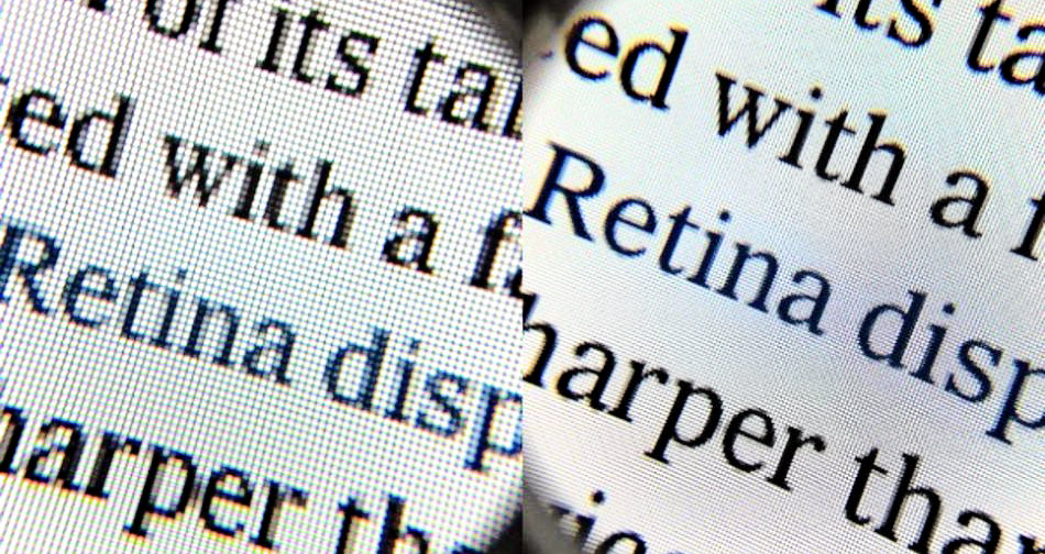
Apple defines a "Retina" display as one that has a pixel density so high – roughly 300 or more pixels per inch – that a person is unable to discern the individual pixels at a normal viewing distance.
In addition to the iPhone 4's display having many improvements and benefits when compared to the iPhone 3GS's screen, the hallmark feature was it's unprecedented pixel density. It boasted a 326 dpi display, which immensely improved the overall viewing quality of the iPhone.
Since then, many other companies have followed Apple's footsteps by shipping HiDPI screens in their phones, tablets, computers, and everything in between. These displays sparked great change in web and app development.
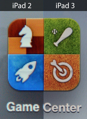
Because of the massive increase in resolution, many image-based websites displayed disastrously on these displays.
Text and CSS-generated graphics render great on a Retina display, but any standard resolution image ends up looking blurred because there are 4x the amount of pixels.
So in order for a standard 500px x 500px image to look good on a retina display, it has to be 1000px x 1000px.
Because of this, if you're designing a graphic/image driven website in Photoshop, you'll need to set up your document to be twice as wide as you'd like it to be.
For example: If your website's maximum container-width is 1000px in a browser, you should set up your Photoshop document to be 2000px wide instead. It won't display as 2000px in a browser, but your developer can save @2x images that'll render wonderfully on retina displays.
If you're working with a good developer, the site load time won't increate at all for non-retina users, and these high-resolution images will only load for devices that need them.
To this day, even highly trafficked sites (I'm looking at you, Twitter) haven't improved their websites to support on these Retina displays. The market share for Hi-DPI screens is growing fast, so be ahead of the curve.