
I'm sitting in an airport right now, waiting for a flight. Taking a quick glance around me, I see a handful of people doing who knows what on their tablets or smartphones. For all I know, they could be on your website. Whether the experience they're having is optimized for them is another story.
Today people are reading, watching and buying on smaller devices and in more places than ever before. The number of active smartphone users is rising at a ridiculous rate and it hasn't shown much sign of slowing down.
I know, you're probably wondering why on earth I'm writing an article about responsive design on a site that isn't even responsive. But in fact, that's why I'm writing this. The landscape for web is changing rapidly, and we're doing something about it.
We're working on some things that we're thrilled about, and hope to show them to you in the coming months. I'm writing this to hopefully convince you to make the same changes. If your work isn't accessible everywhere already, this article will hopefully lead you in the right direction.
I plan on getting into much more detail on this subject in the future, but I've put together a few ways to start getting your site optimized for every device, and making your work more future proof.
Focus On Your Content
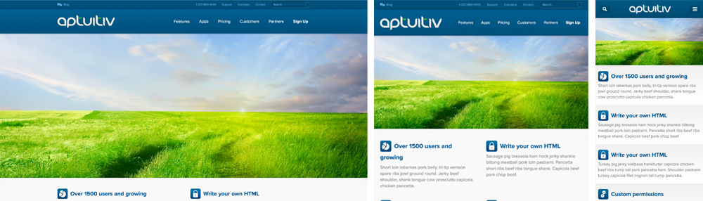
Content is the reason you're designing a website, so your layouts should compliment and display your content in the most logical and appealing way possible, no matter what the device is. If you're designing your site to display perfectly in one resolution, you'll end up leaving out many other devices in the marketplace today.
Should you make a mobile site?
No. Absolutely not! Being more accessible to all devices doesn't mean "getting a mobile website." Have you ever been to a true mobile website and actually enjoyed it more than the full version? Probably not, and that's because most mobile websites are usually limited versions of the desktop site with missing navigation and functionality.
However, if designers put a little more thought into these mobile sites, they could easily expand into something more focused and better than the "desktop-version." The beautiful thing about mobile designs is that simple navigation and content hierarchy takes priority, while decorations and clutter seem to disappear.
For some people today, their smartphone is their computer. Smartphones have nearly every capability a PC does in a much smaller package. So the best option is to design one great website that's focused and tailored for any device thrown at it.
Mobile First
If you've followed the mobile web movement at all, you almost certainly have heard of designing for mobile-first.
You can argue that designing for mobile-first ultimately comes down to personal preference, but there's a benefit for some people to taking this approach. Because you're forced to display content in a very hierarchical way you'll end up removing clutter from your site and begin to simultaneously think about optimizing content for less screen real-estate. This is a good thing.
There are plenty of articles and books that talk more about this so I won't go into any more detail. After all, if you're not designing with content hierarchy already, why are you designing in the first place? Decide for yourself which route to take.
Compatibility
Want to target every device ever? You should know that some really old people don't know what Javascript is and might have disabled it. There are also some "smartphones" on the market that are terrible at supporting even the simplest Javascript. Therefore, to make a truly accessible site, it really needs to at least function without Javascript.
There are great ways to accomplish this while also giving a cutting edge experience to all modern users. The quickest and easiest is with Modernizr, which provides great browser detection tools and many other accessibility features.
For testing purposes, I like to disable Javascript on my device's browser to make sure things still work decent, and improve the site accordingly. Testing involves a lot of trial and error, but once you get the hang of writing code that makes your site accessible without Javascript, it becomes second nature.
Breakpoints

I strongly urge you to avoid using breakpoints to target specific device resolutions. This is a bad approach because resolutions always change, adapt, and improve. Not too long ago everyone was targeting 1024x768 screens because it was a safe size and easily the most common resolution. In just a few short years however, everything has changed. Now the best screen size to target is every size.
Make your site work on everything because your goal should be for everyone to be able to use it. Use breakpoints to your content's advantage and don't just pick a width because that's what the current iPhone is.
Retina Displays
With the recent rise in high-resolution displays for everything from smartphones to tablets to laptops, many developers are using media queries to optimize their sites for these displays. Market share for these screens is rising fast, and Retina optimization is definitely something to keep in mind. Using higher resolution images and tweaking fonts are a couple ways to cater to these displays. Thankfully, detecting these high resolution displays is quite simple.
CSS:
Javascript:
Some devices have pixel density ratios in between 1 and 2, like the new Google's Nexus 7. The displays are not necessarily dense enough that you'd need to load 2x images for it but it's something to keep in mind. The code samples given above would target displays like the Nexus 7. Although I just gave 2 methods, there are many articles that get much more in-depth on ways to serve Retina graphics for your site and move towards a Retina web. Learn from them, and choose a technique that's right for you.
What's Next?
You don't need to make sure your site looks the same on all platforms. You need to make sure it's easy to use and optimized for all platforms. Cross-platform consistency isn't the key. Every device has different strengths so it's perfectly fine that your website does too, as long as the content of your site can be viewed everywhere.
The internet is everywhere and accessible on screens of all shapes and sizes. If people aren't able to access or enjoy your website on the device they're using, then your work was for nothing. Decorations and special FX are overrated and content is often forgotten. Use media queries, focus on your content and don't forget about the devices that don't exist yet. Every experience is important.
Let's stop talking about responsive design, HTML5, and CSS3 like it's a revolution happening in the future. The "future" is happening now. Even huge companies like Microsoft, Starbucks, and The Boston Globe have all been boasting fully-responsive sites for a while now. They're not perfect, but they're trying. I think it's time we all do the same.